

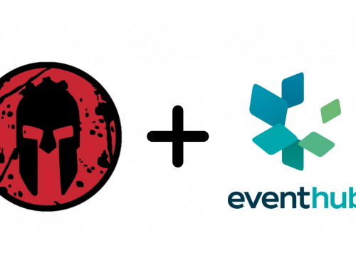
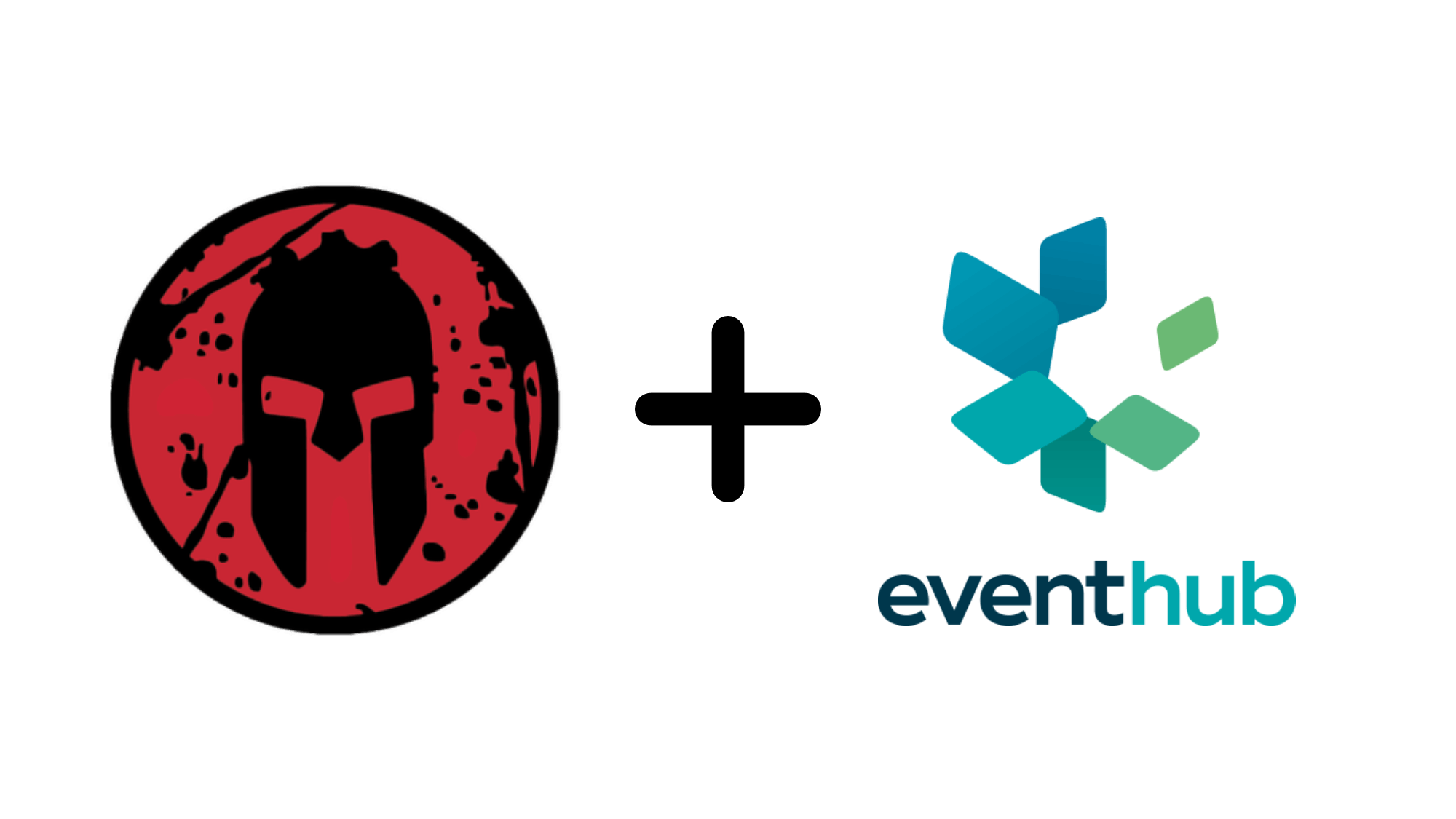
We are proud to announce the launch of our rebrand to “Event Hub”! While Events Locker was good to us we are excited about our transition to “Event Hub” as we believe the new logo, colors, and fonts better align with our core values and mission as a company.
The rectangular festival badge shapes in our graphic represent the non-attendee participants like exhibitors, sponsors, groups, and more that contribute to the backbone and culture of every live event. The shapes converge to form a globe symbolizing our intent to build a vibrant live community, or “hub” by connecting organizers and exhibitors through our intuitive, clean, and quick event management platform and marketplace.
Our new primary brand colors: sherpa blue and dark cyan, represent the helpful, friendly, and calming support we hope to be for our customers.
Thank you to all of our customers for coming on this journey with us as we continue to evolve and grow! We will be implementing the new logo and color scheme into the Event Hub site this coming Monday. If you have any questions about how the rebrand will affect site functionality please refer to our previous blog post here, or email reach out to us at help@eventhub.net.

